Stages first
The purchasing model arrived after doctors had committed to a quantity.
uLab Systems
Marketing asked me to add new bundles to an existing desktop checkout. I led the MVP that moved the purchase decision to the start, preserved à la carte, and made the bundle balance clear before checkout.
01 · Problem
Doctors chose stages, materials, retainers, and shipping before seeing the total at final review.
uLab makes clear aligners. Orthodontists design a patient's treatment in uLab's software, then order the physical aligners to be manufactured — often in batches over a case that runs a year or more.
The desktop flow had no bundle model. It moved through coverage, treatment stages, material, and shipping before revealing price at the end. Comparing another path meant backing up through decisions the doctor had already made.
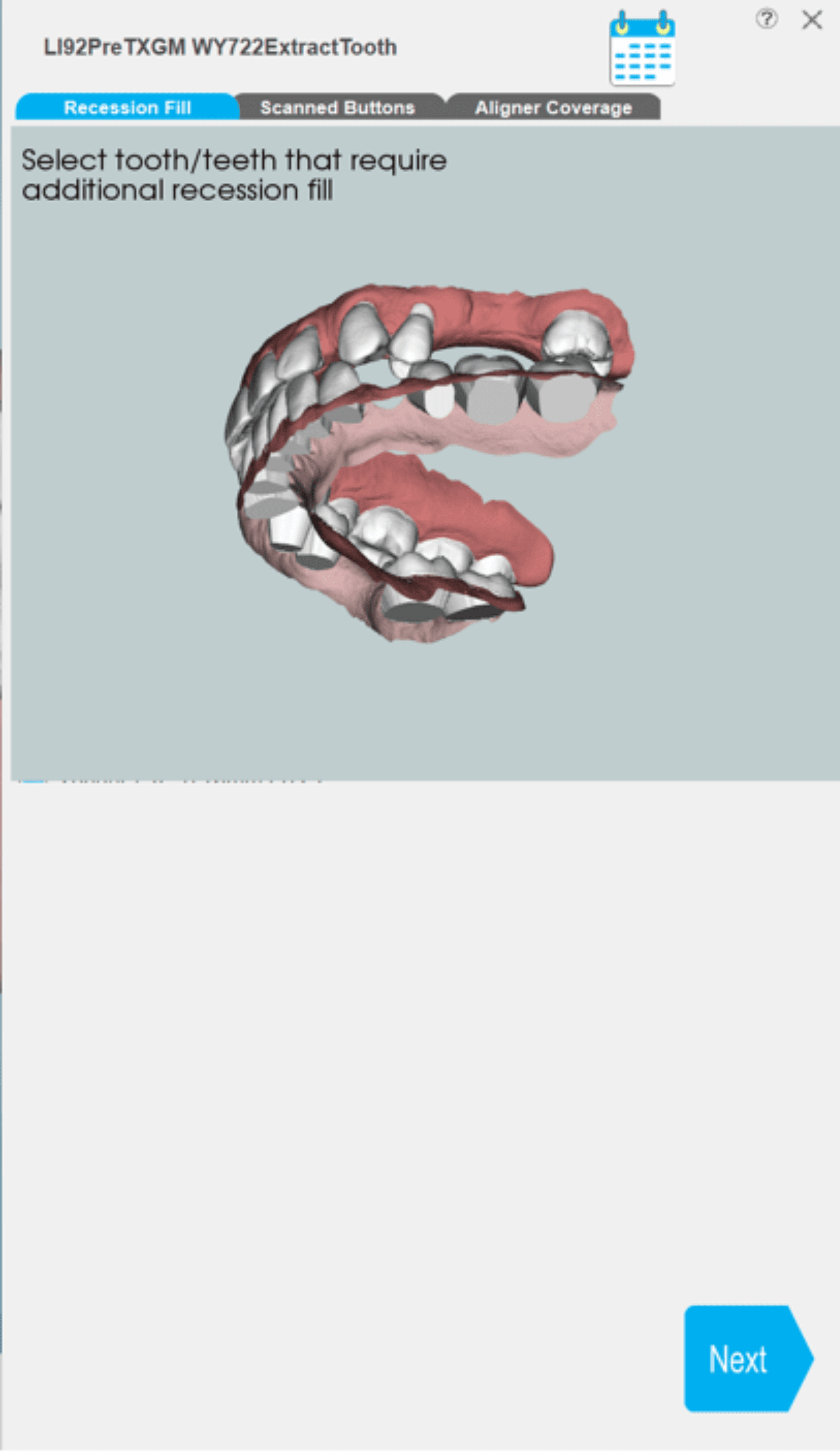
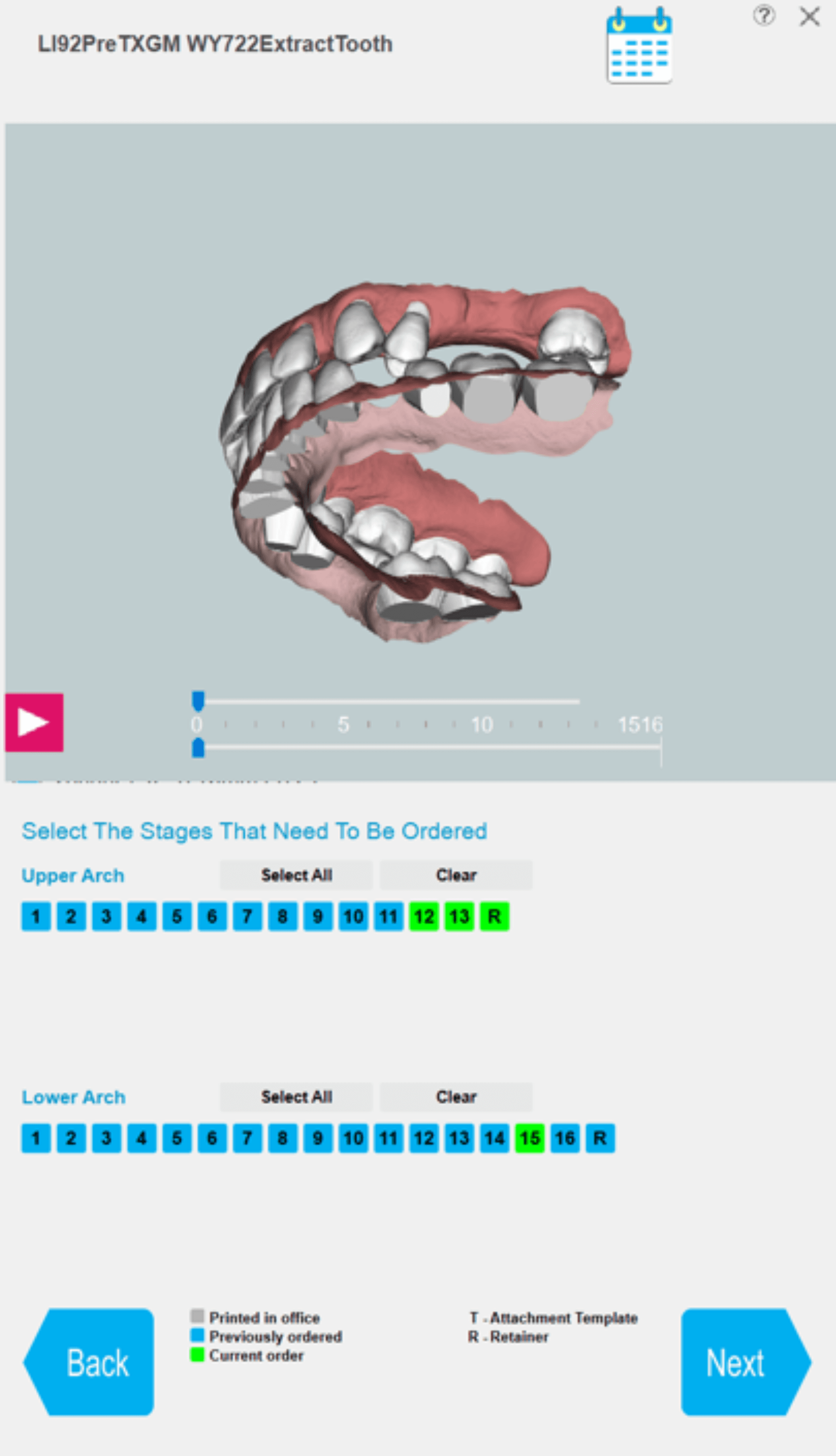
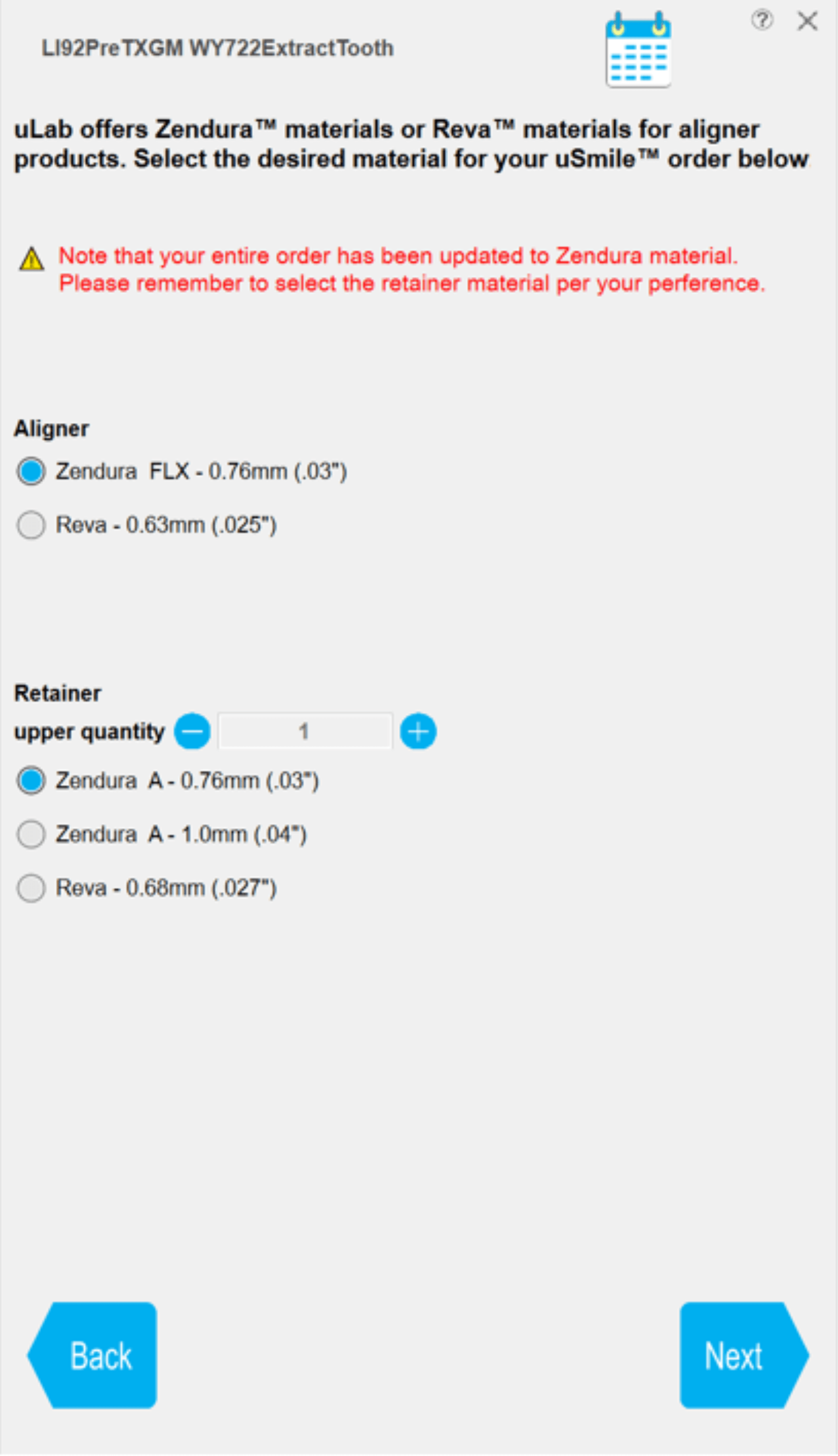
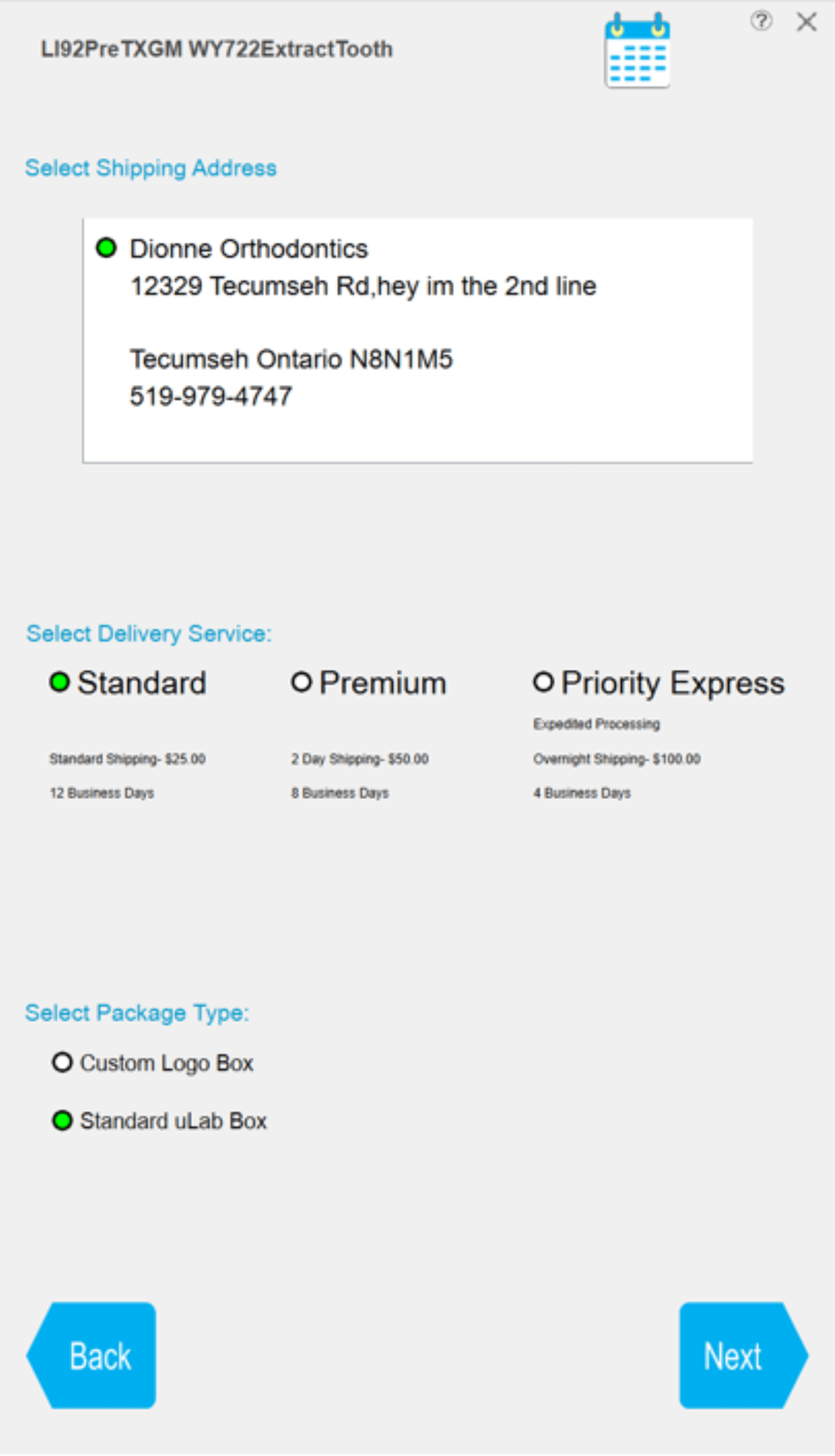
The price appeared after the decisions that created it.
02 · Reframe
Marketing introduced three bundles and asked me to fit them into the existing desktop flow.
The pricing still carried a catch. Mild covered up to 24 aligners, but a 30-aligner treatment needed six more at $21 each. The number marketed on the card and the number billed for this patient could be different.
THE DESIGN TENSION
How do we promote bundles without obscuring what this patient will cost?
Marketing needed adoption. Doctors needed to understand the purchasing model before configuring the order—and trust the number shown before checkout.
The advertised bundle and this patient's total were not always the same number.
03 · Decision
I led workshops with the Marketing Director and CCO to translate the new commercial strategy into an ordering experience.
Initial direction
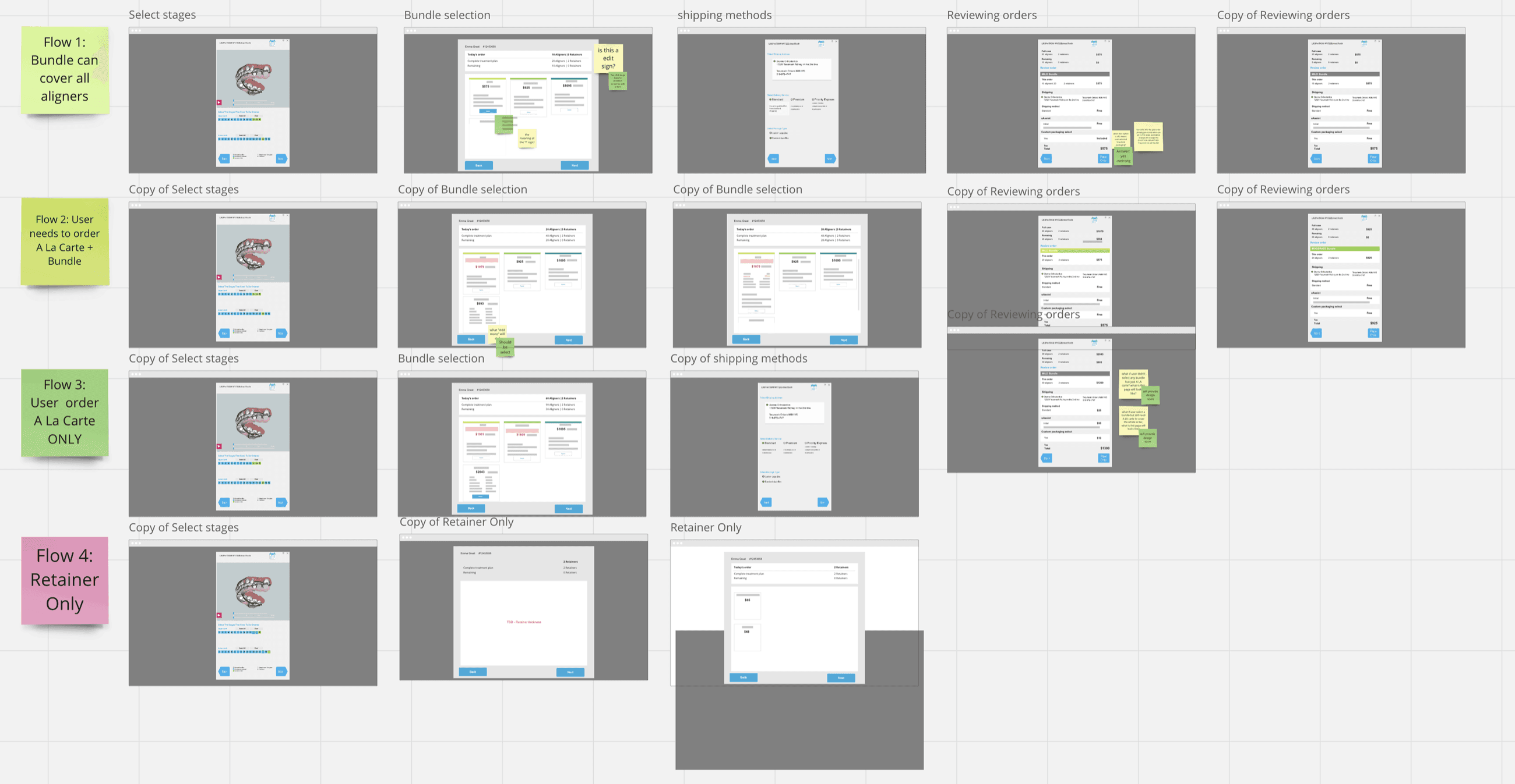
The first direction preserved the old architecture: doctors selected how many aligners to order, then saw bundle options as the next step. It reduced engineering change, but placed the new purchasing model after the decision it was meant to guide.
Sequence decision
Once doctors selected a quantity, they were anchored to it and mentally committed to the existing path. A bundle shown afterward felt like an interruption—and asked them to reconsider work they had just completed.
I moved bundle or à la carte selection to the start. To keep that early choice grounded, the screen showed the total aligners needed to complete the case above the options.
The purchasing model arrived after doctors had committed to a quantity.
Doctors saw the complete-treatment aligner count before choosing bundle or à la carte.
Overflow detail
A 30-aligner case exceeds Mild's 24-aligner allowance by six. I explored how to keep the bundle price comparable while making the overflow clear before selection.
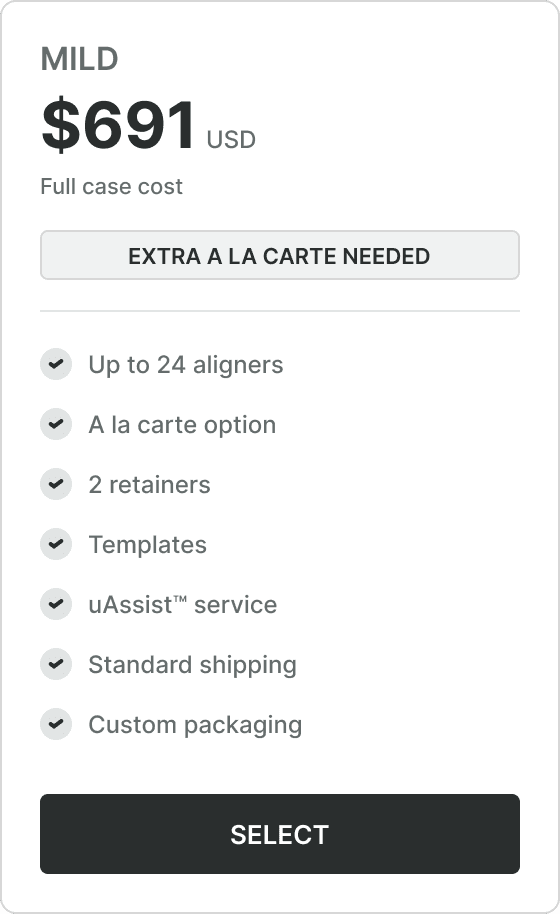
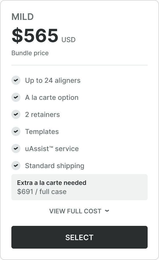
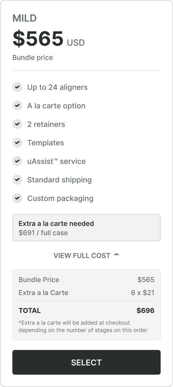
Preserve the bundle price. Expose what changes the patient's total.
04 · System
Rather than rebuild every downstream screen, I concentrated engineering effort where the buying decision changed.
The MVP changed the sequence, patient-specific pricing, and final bundle summary. Existing stage, customization, and shipping behavior stayed wherever it still worked.
I deferred automatic bundle recommendations because the dependable rules and connected data across NetSuite and Salesforce did not yet exist. Instead of delaying the launch or presenting an unreliable answer, the MVP let doctors compare the patient-specific totals directly.
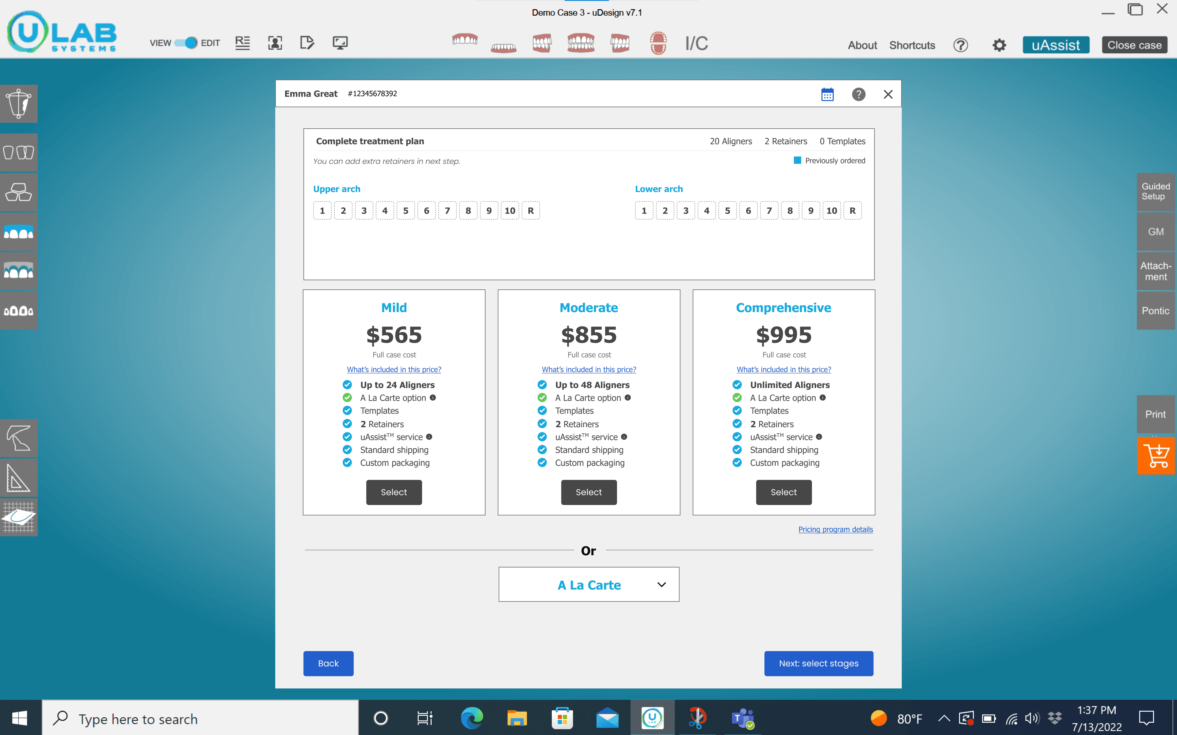
Compare bundle and à la carte using the total aligners needed for this patient.
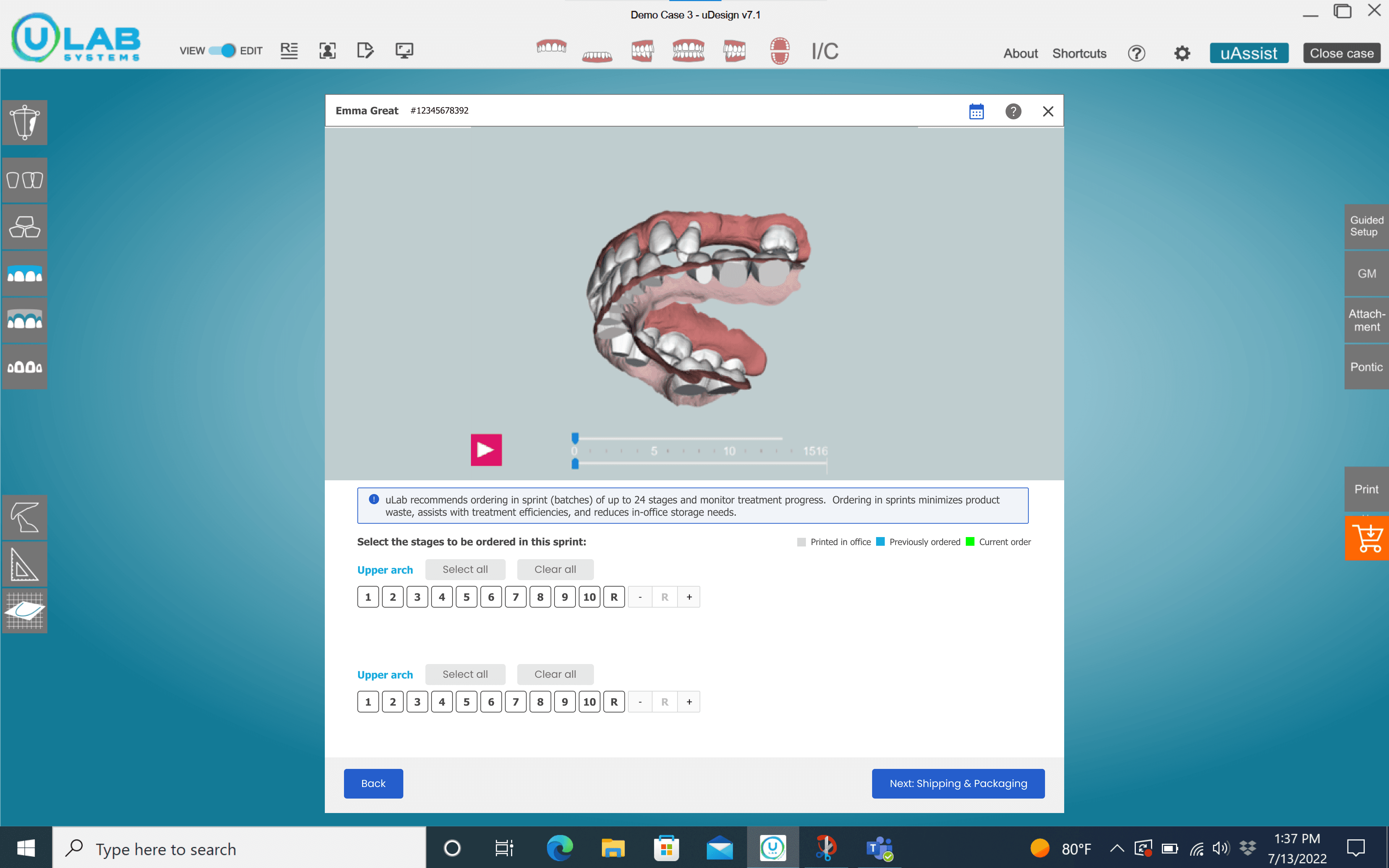
Choose which aligner stages are included in today's order.
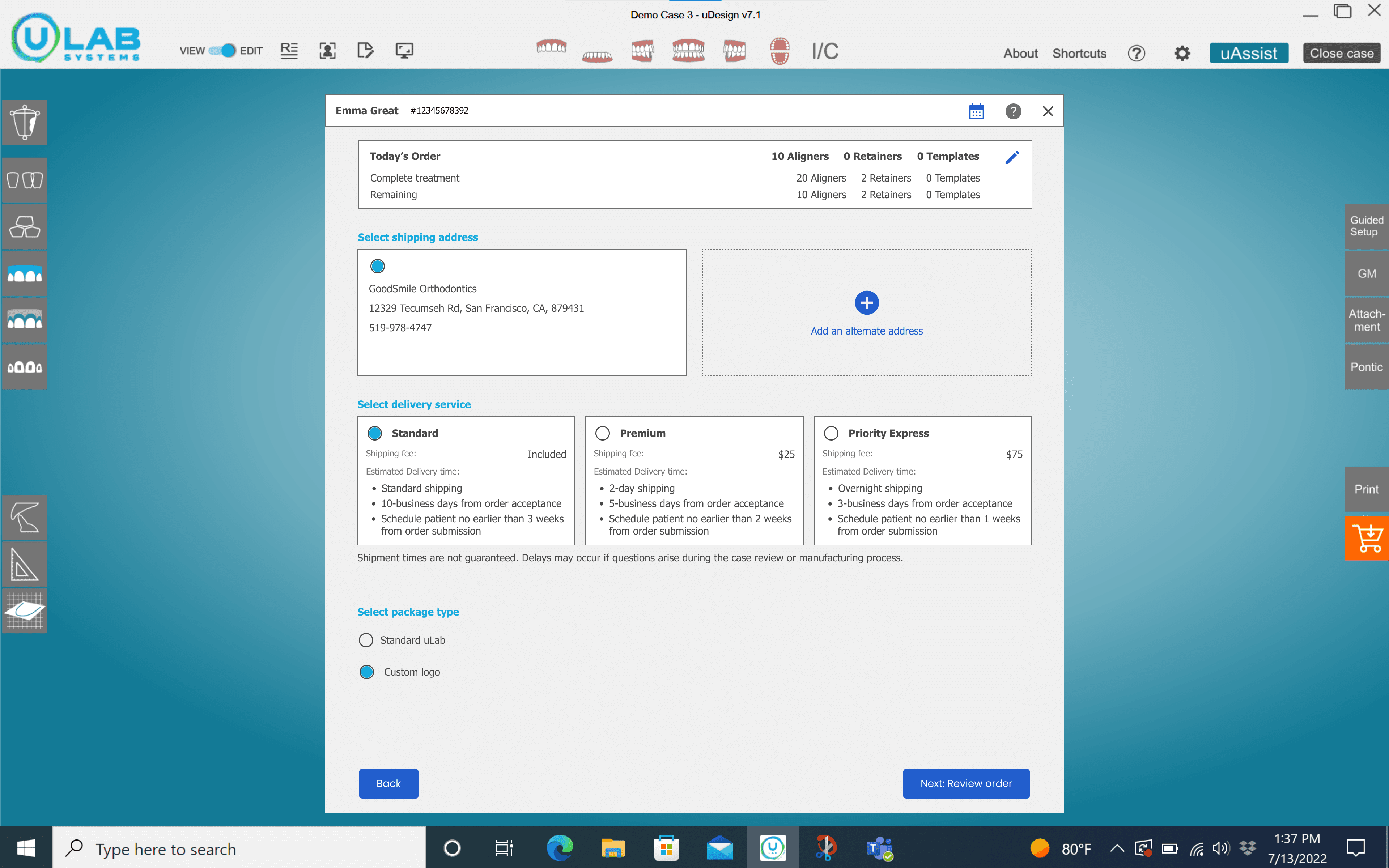
Select the shipping address, delivery speed, and packaging before review.
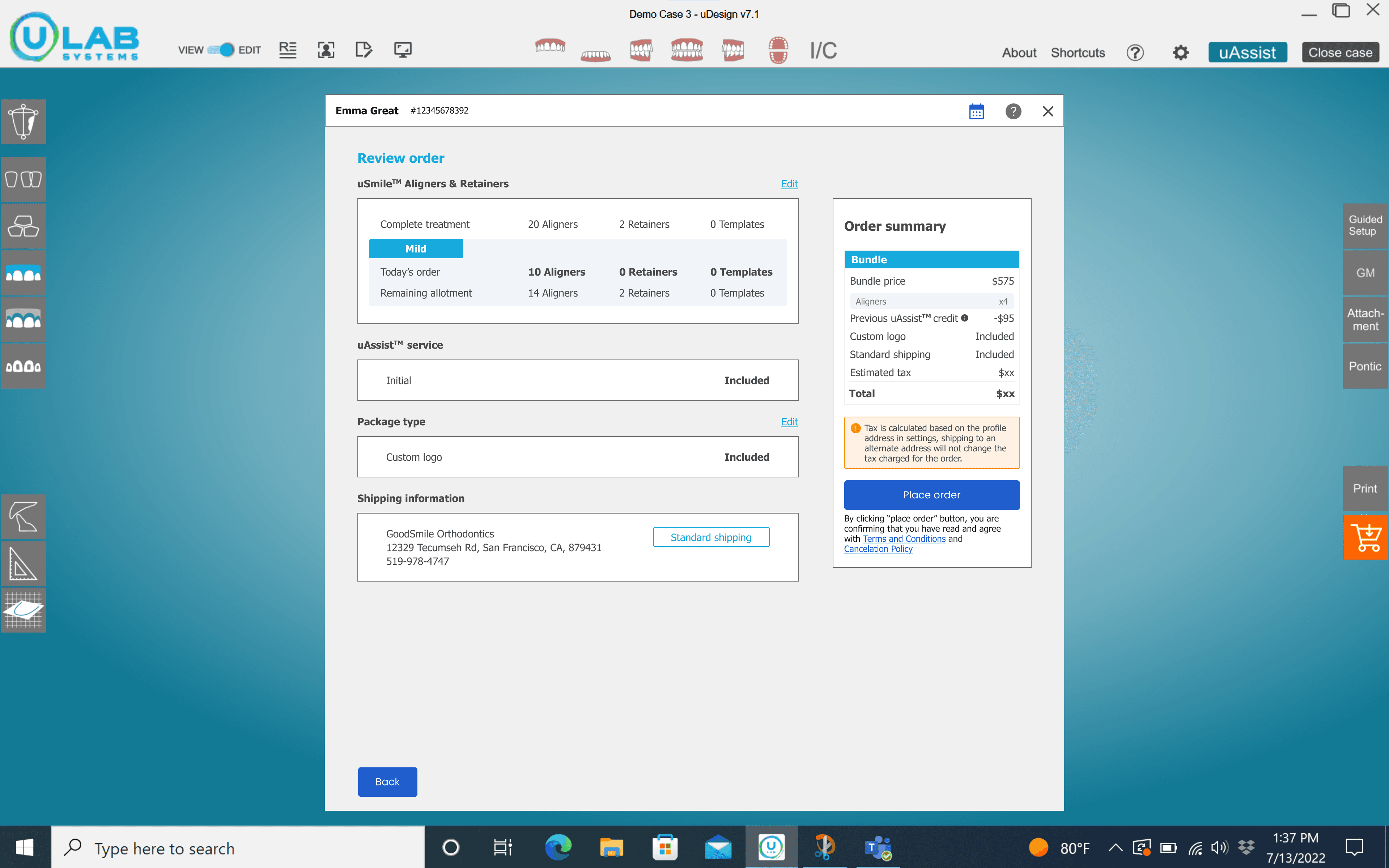
Confirm the selected bundle, what this order uses, what remains, and the final total.
The MVP changed where the decision happened—not everything downstream.
05 · Evolution
The desktop MVP made one purchase understandable. The web platform needed to make the remaining bundle legible across future orders.
The desktop flow opened ordering in a modal over the 3D case because doctors once needed the treatment model nearby. In uCloud, bundle selection and fulfillment no longer required that reference.
I moved ordering into a dedicated full-screen flow. The extra space clarified progress, kept the patient and bundle context visible, and gave each purchasing decision enough room without competing with the treatment workspace.
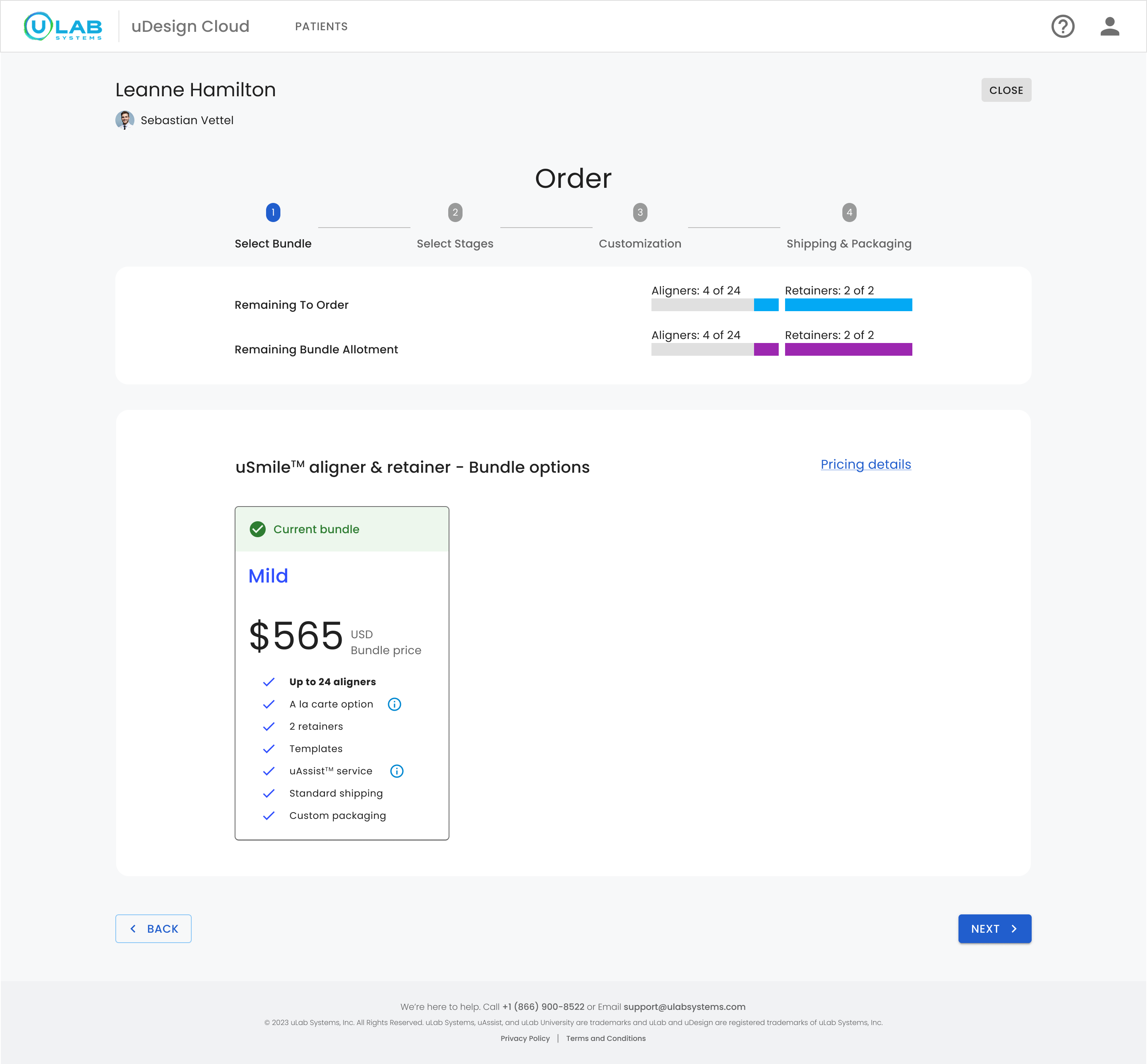
Case need stays visibleThe doctor sees what remains to complete this patient's treatment.
Bundle balance is separateThe remaining aligners and retainers in the bundle persist across orders.
Current purchase modelThe active bundle remains explicit before another order changes its balance.
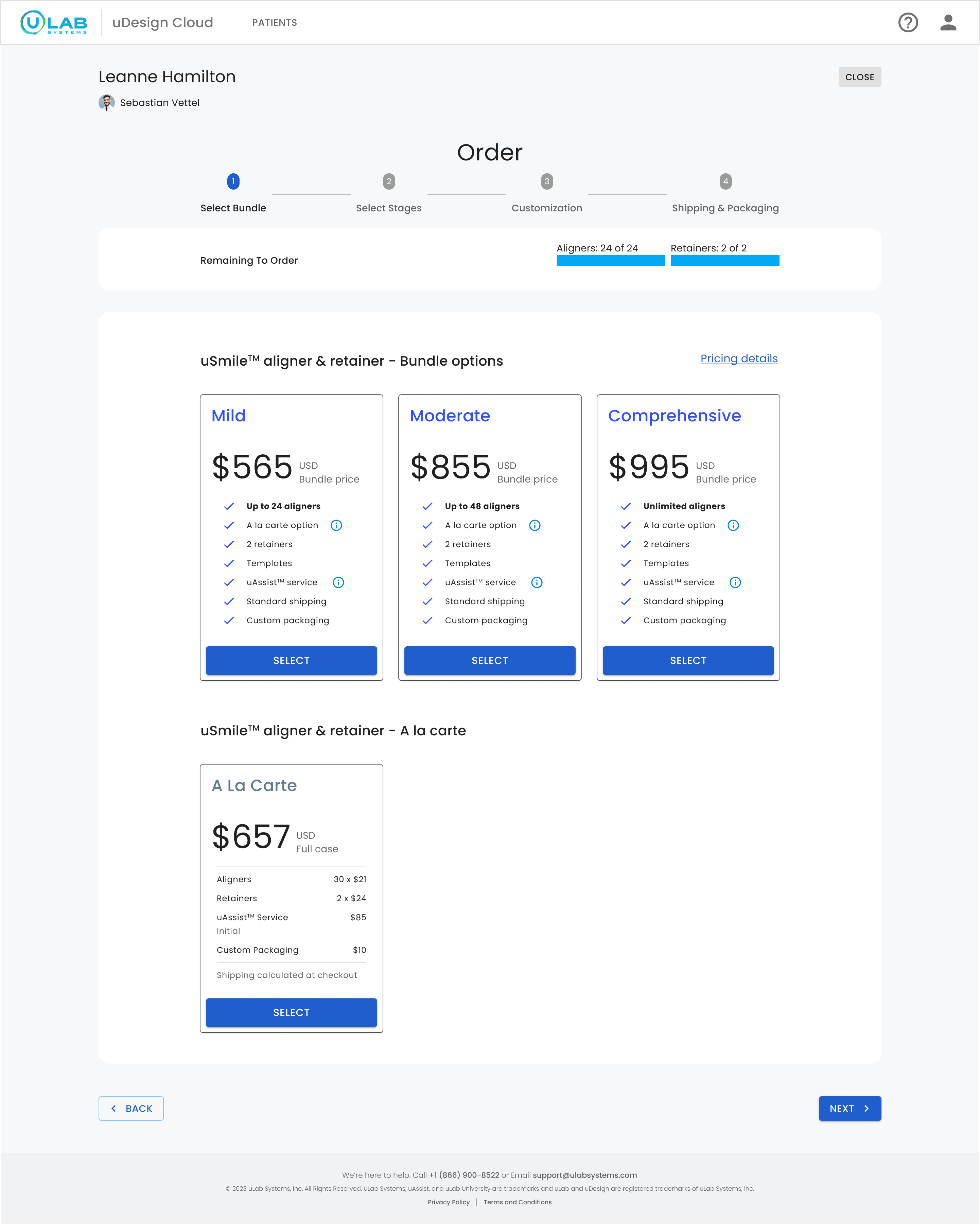
Compare bundles with à la carte while the remaining treatment need stays visible.
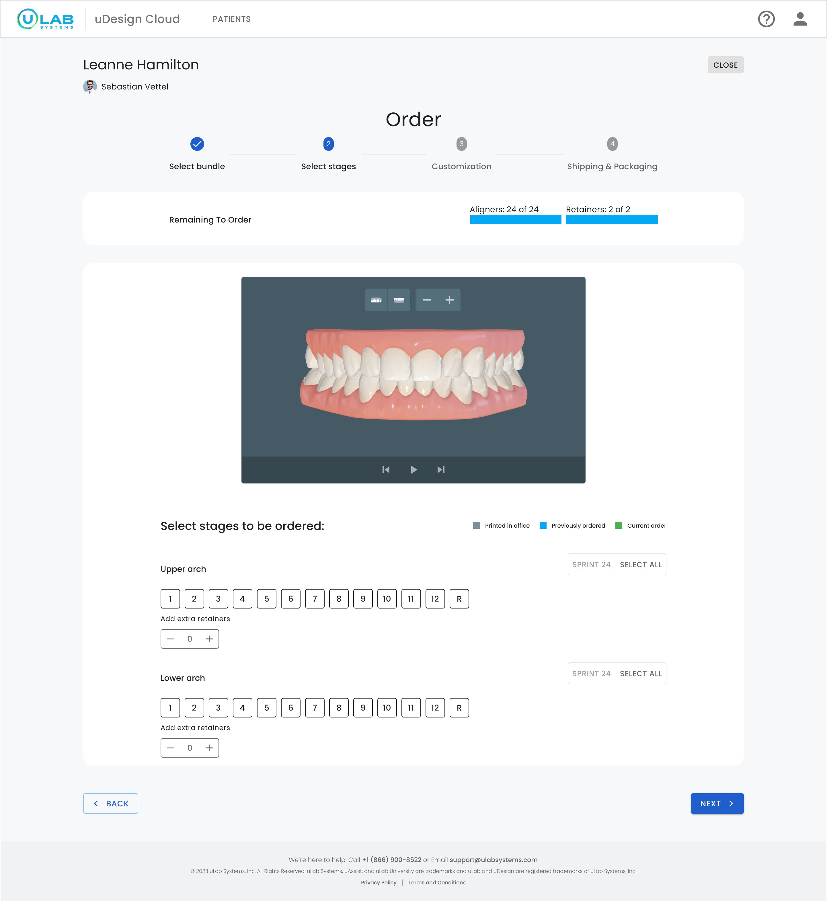
Choose the aligners and retainers included in this order.
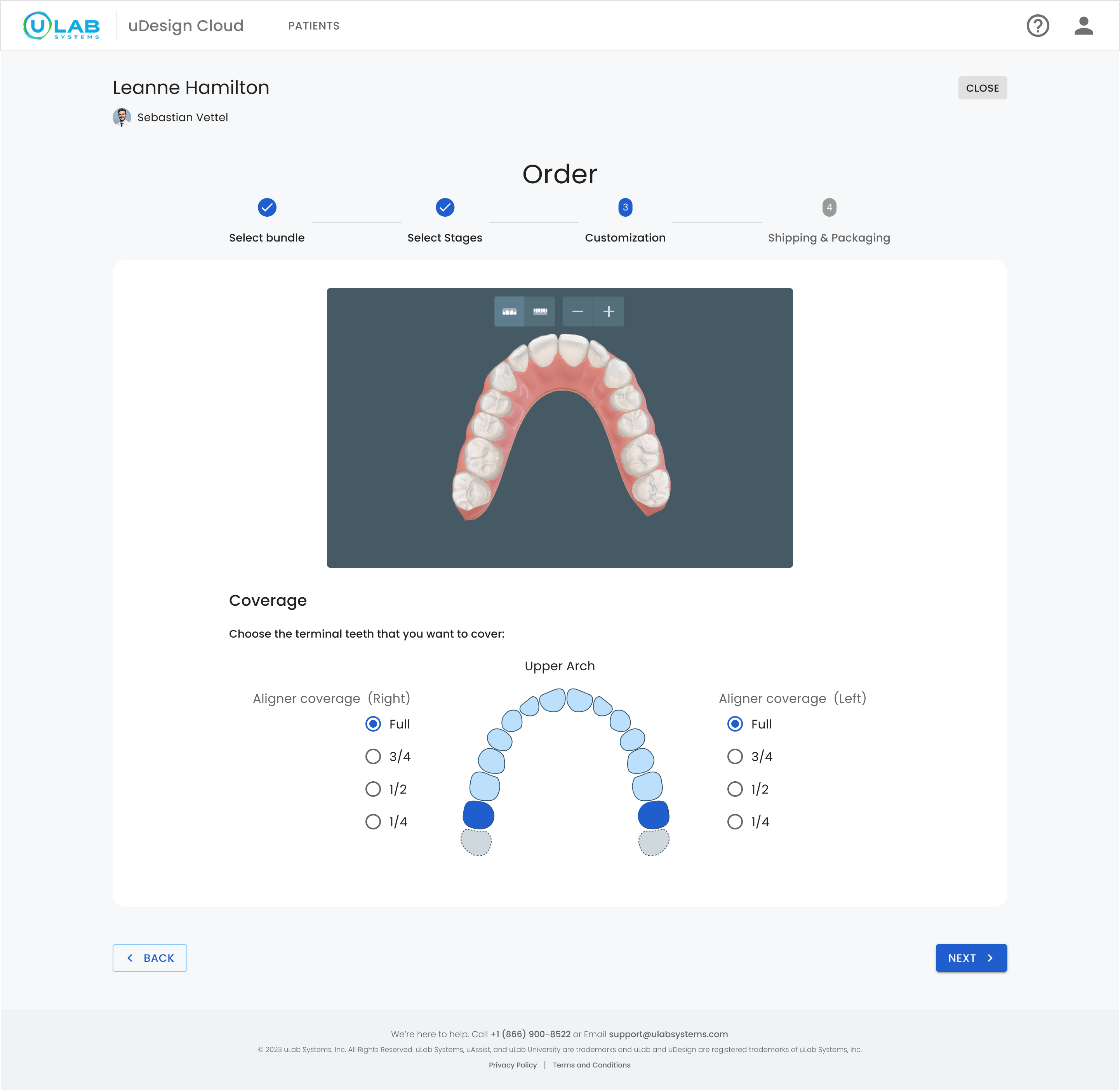
Set coverage and case options after the purchasing model is established.
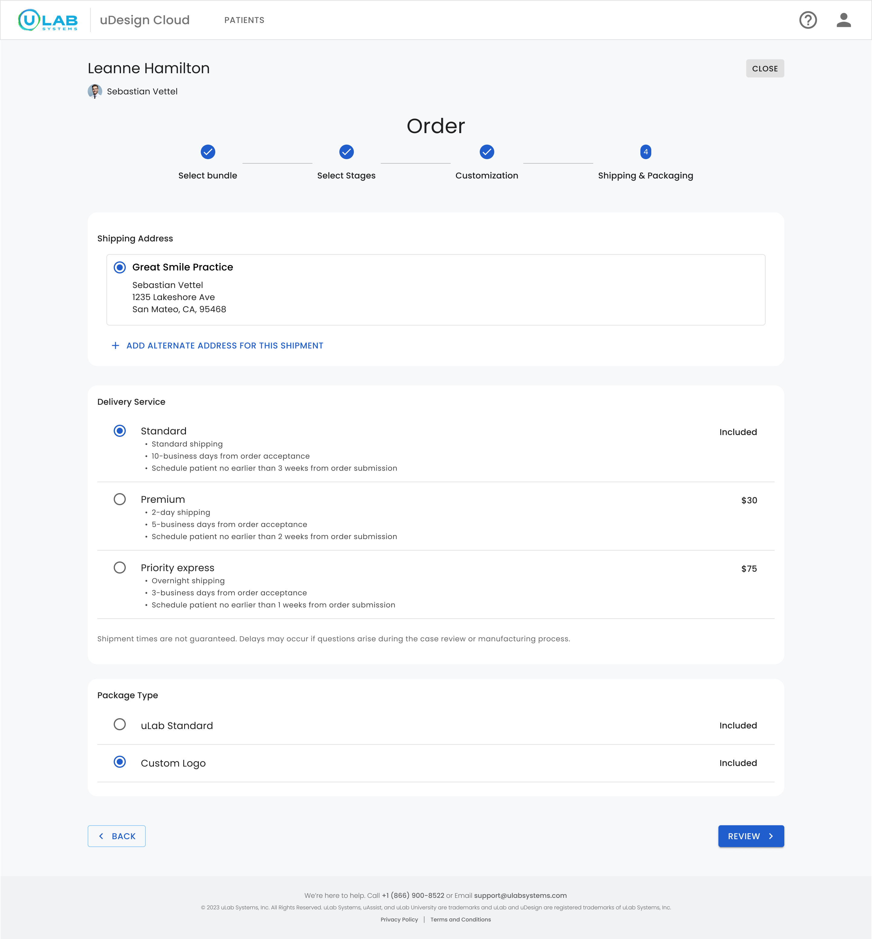
Confirm the address, delivery speed, and packaging in one dedicated step.
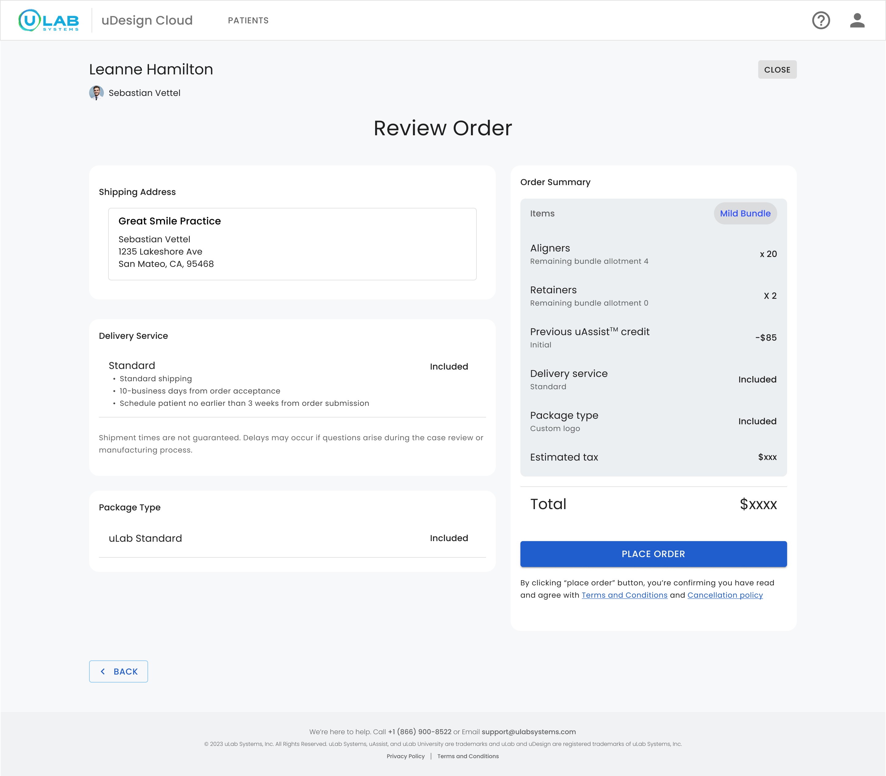
See the bundle used, remaining allotment, included services, and final total before committing.
The first build made one order honest. The second made three years of them legible.
06 · Impact & reflection
COMPANY-REPORTED OUTCOME
60%increase in product sales after launch
The pricing program and redesigned flow co-launched. I no longer have the reporting window, so I treat this as directional and do not attribute the result to design alone.
Argue transparency in business terms. “A doctor surprised at checkout calls support and doesn't come back” was more actionable than an ethical appeal alone.
Track bundle selection, backtracking, abandonment, support contacts, and tier distribution—not only completed orders.
Recommendation can be valuable, but clarity should not wait for intelligence the system cannot yet support. Ship the trustworthy comparison first; add guidance when the rules and data are ready.
Next case study
Kognitos — You can't trust what you can't see →