Problem 1
Production tools came before clinical decisions.
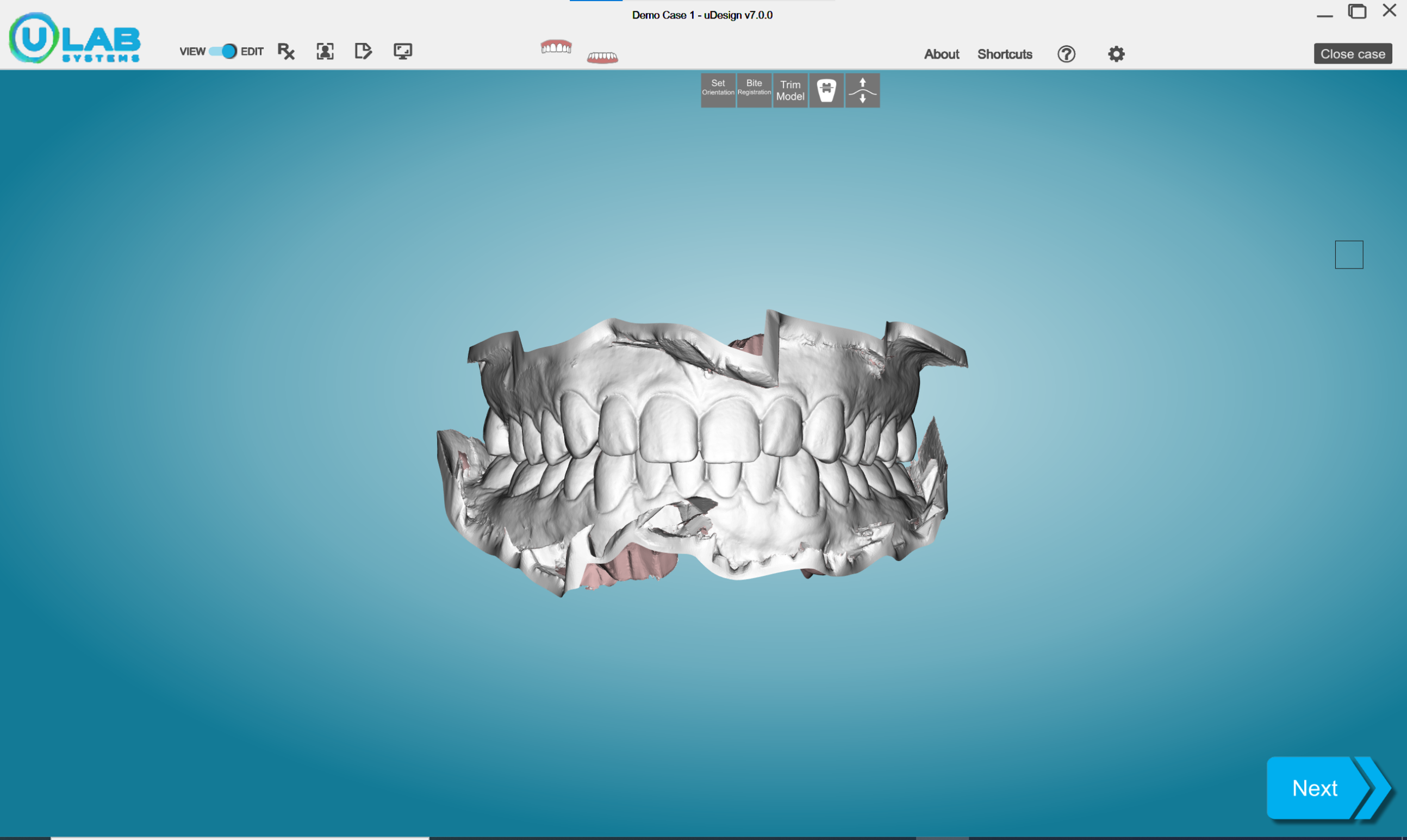
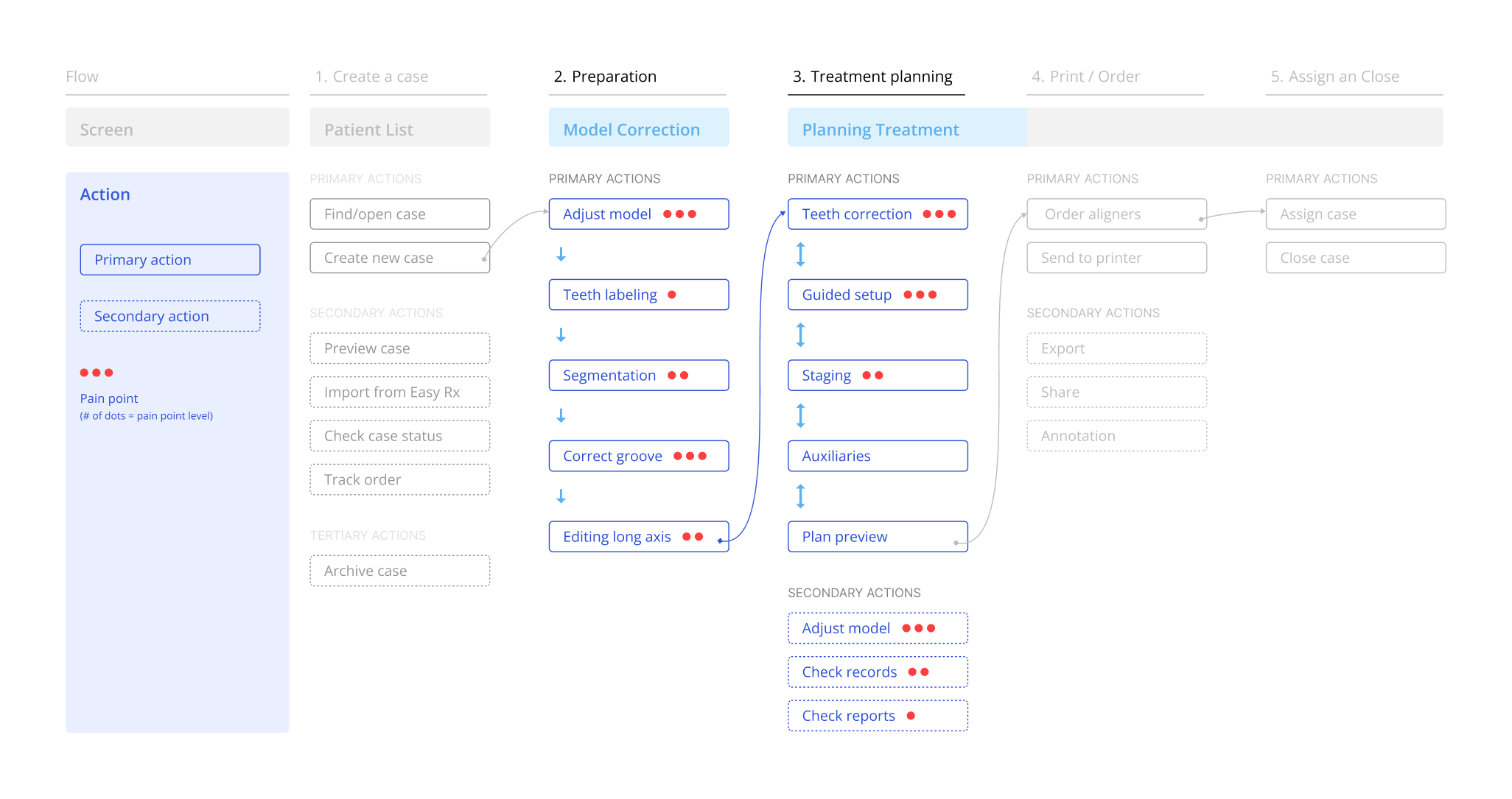
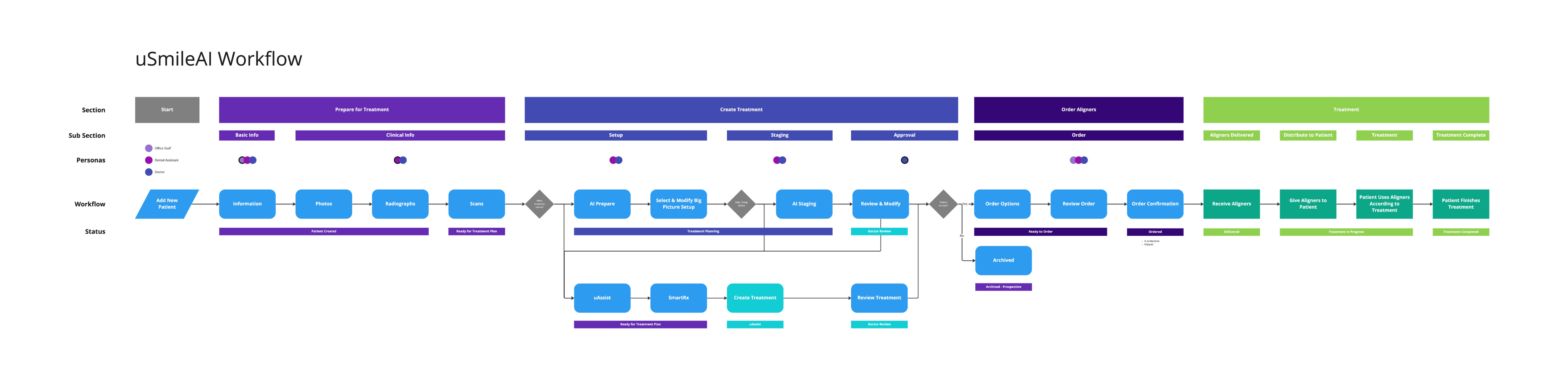
Doctors entered through segmentation, long-axis correction, groove editing, and labeling—tasks tied to preparing a model rather than judging a treatment.
uLab Systems
I redesigned uDesign Cloud's 3D workspace so orthodontists could verify evidence, make precise adjustments, or request expert help before approving a plan.
40%
directional beta improvement in planning efficiency
Priority reset
Conference feedback moved Smart Rx into the first-release scope
Shared system
design foundations adopted across the product portfolio
The problem
I reframed the project around the approval decision: what doctors must understand, change, or question before accepting a plan they did not build. Even when software or a remote planning team constructs the plan, the orthodontist remains responsible for the outcome.
Problem 1
Production tools came before clinical decisions.
Doctors entered through segmentation, long-axis correction, groove editing, and labeling—tasks tied to preparing a model rather than judging a treatment.
Problem 2
Checking evidence meant leaving the decision.
Doctors moved away from the model to check records, prescription intent, planned movement, IPR, or attachments—then had to reconstruct what they were reviewing.
Problem 3
Similar actions behaved differently across the journey.
The same clinical concept used different controls from one stage to the next. The product was powerful, but doctors could not build a predictable mental model.
Research
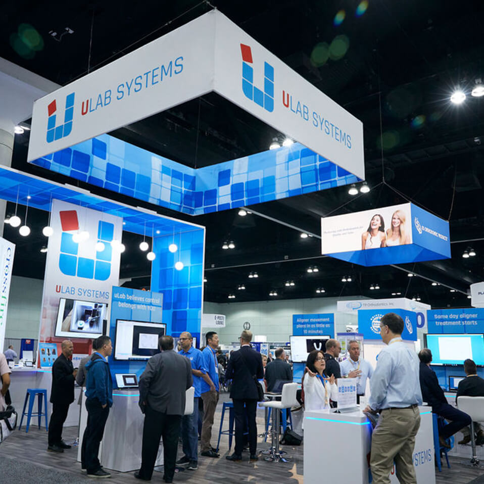
My research combined interviews, workflow observation, a 15-person card sort, and feedback from roughly 20 orthodontists at the American Association of Orthodontists (AAO) Annual Session. The evidence separated clinical needs from requests for more 3D tooling: doctors were struggling with the software work surrounding orthodontics, not the clinical decisions themselves.
01 · Interviews
6orthodontists
What only this could answer
What do doctors say they need from planning software?
What it returned
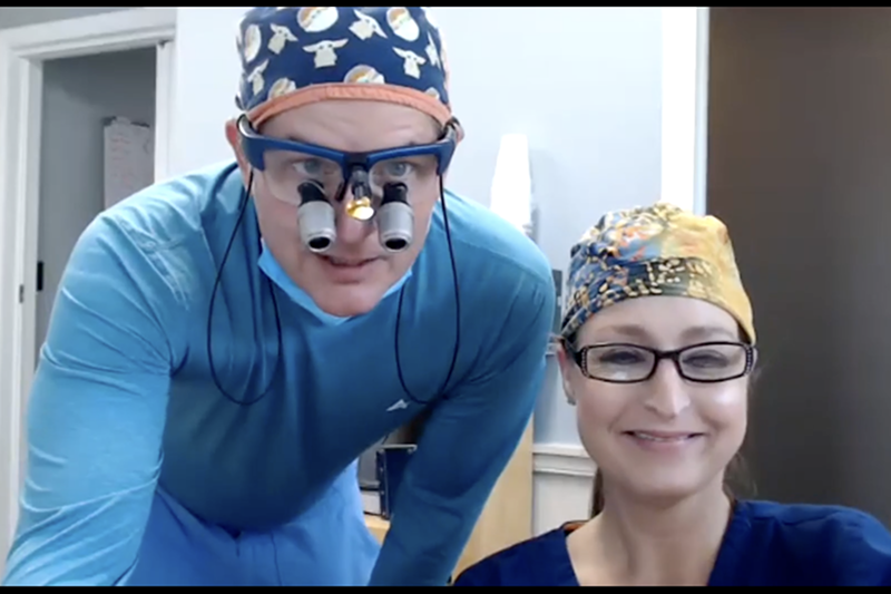
They described the constraint as time and confidence, not capability. Complex cases got routed to the tool they already trusted, not to the tool with more controls.
02 · Office visits
2orthodontic offices
What only this could answer
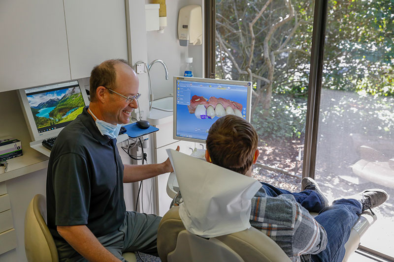
What happens at the chair that nobody reports in an interview?
What it returned
Assistants run the setup. The doctor arrives to judge a plan they did not build — with no fast way to tell a good plan from a wrong one.
03 · Conference feedback
~20orthodontists at the conference
What only this could answer
How do doctors react to automation before they have ever used it?
What it returned
“I don’t really trust AI things. But this Rx thing sounds really interesting.”
Appetite for the prescription, doubt about the automation underneath it.
Participants grouped the toolset around three clinical tasks—viewing the case, moving teeth, and evaluating treatment results or staging. That structure informed the persistent shell and contextual controls.
“I want to make clinical decisions, not learn 3D modeling.”
Orthodontist interview
The concept I took to the conference
I translated the three workflow problems into one initial direction: AI handled model preparation, doctors started from generated treatment options, and uAssist remained available inside the same case.
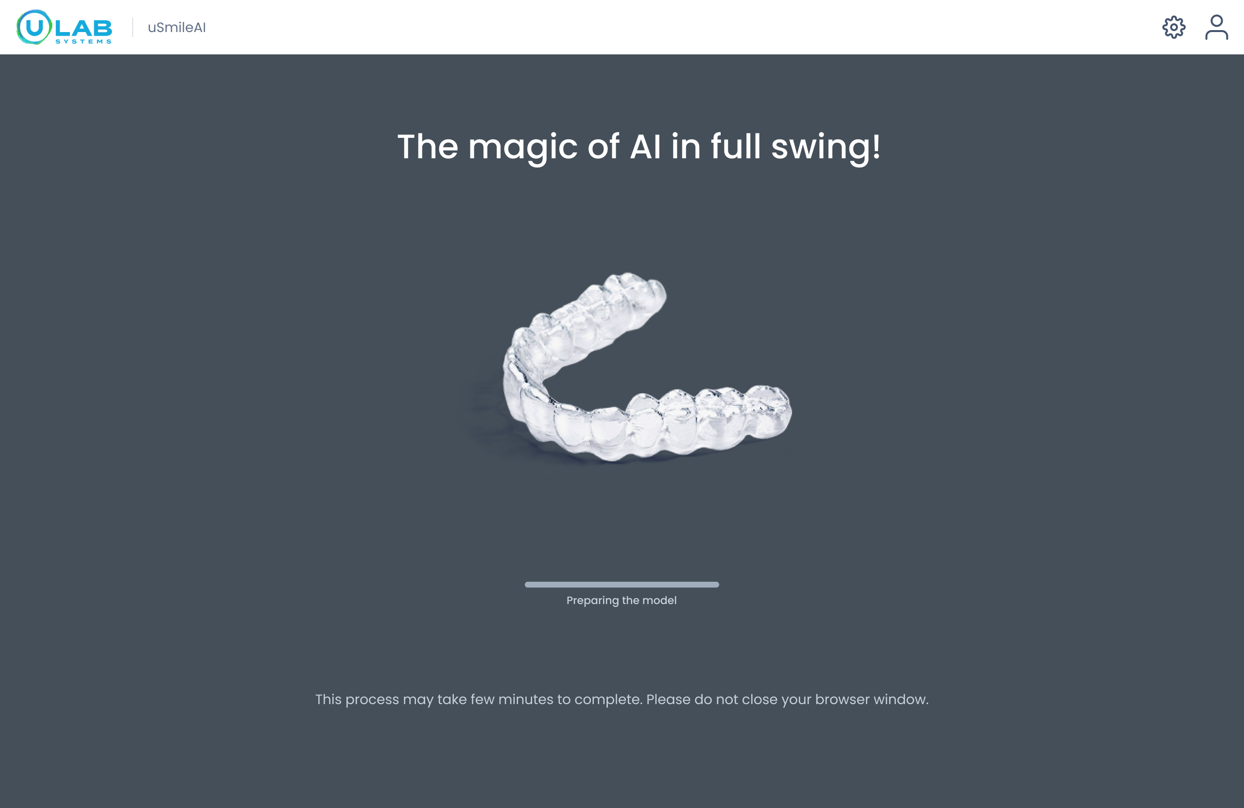
Automate preparation
Doctors entered with a reviewable model instead of segmenting, trimming, and labeling teeth.
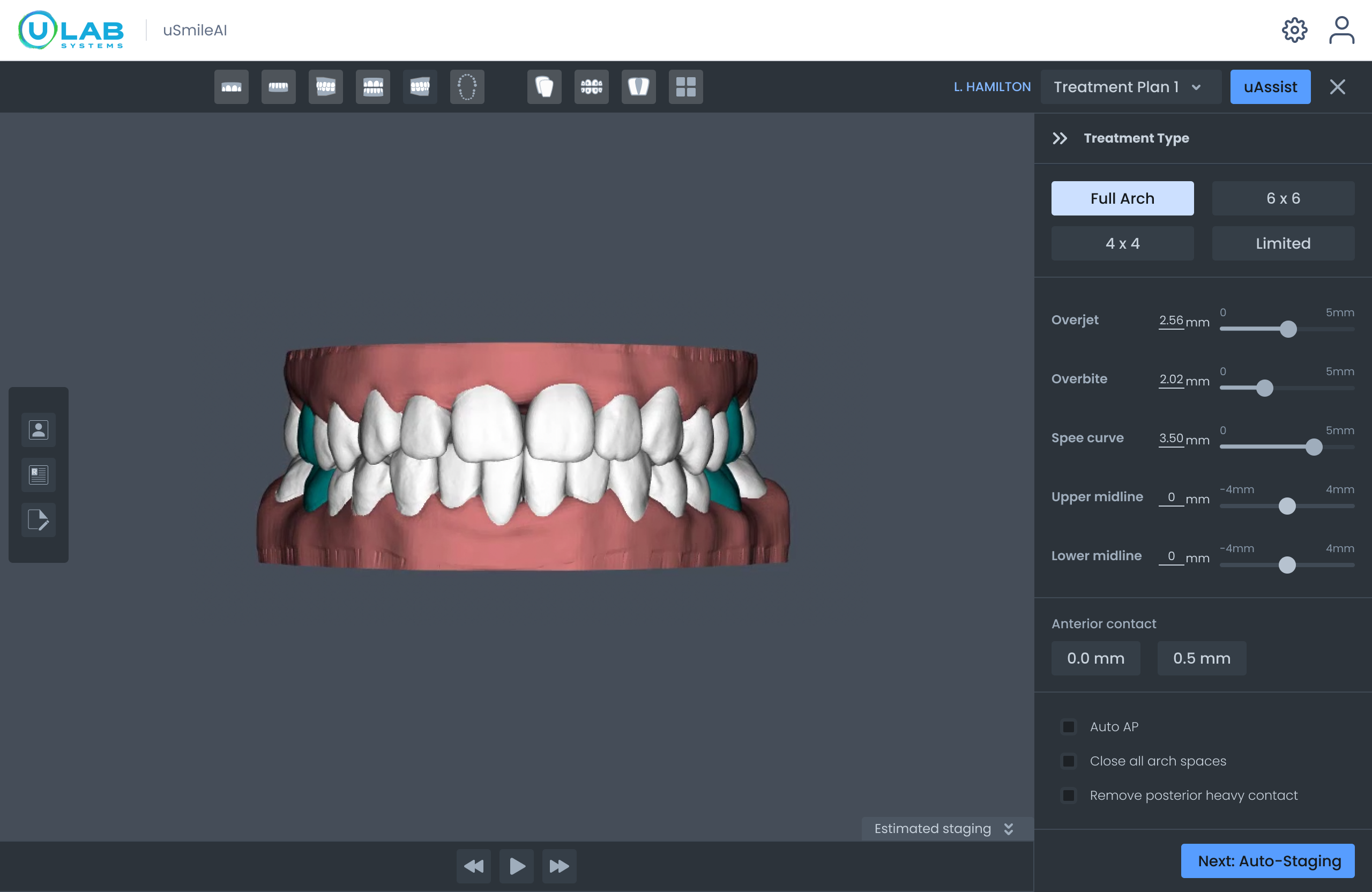
Start from treatment intent
Preset plans provided the starting point. Broad controls supported key treatment choices, while uAssist stayed available as an alternate path.
Conference feedback changed the roadmap
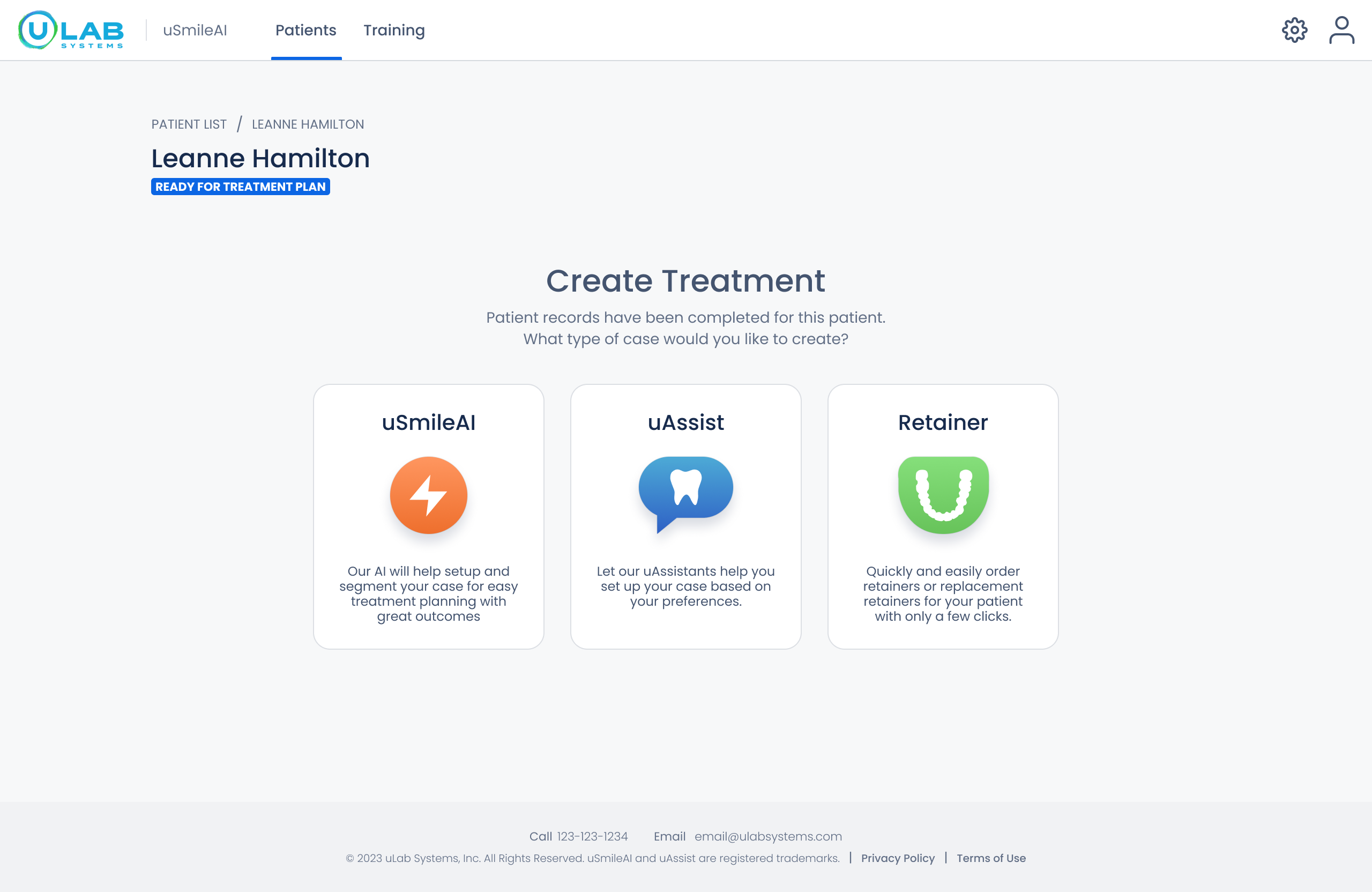
Before the conference, I designed case creation as a choice between AI setup, uAssist, or retainers. Conversations with roughly 20 orthodontists showed stronger demand for an expert-authored treatment plan than another path into plan construction.
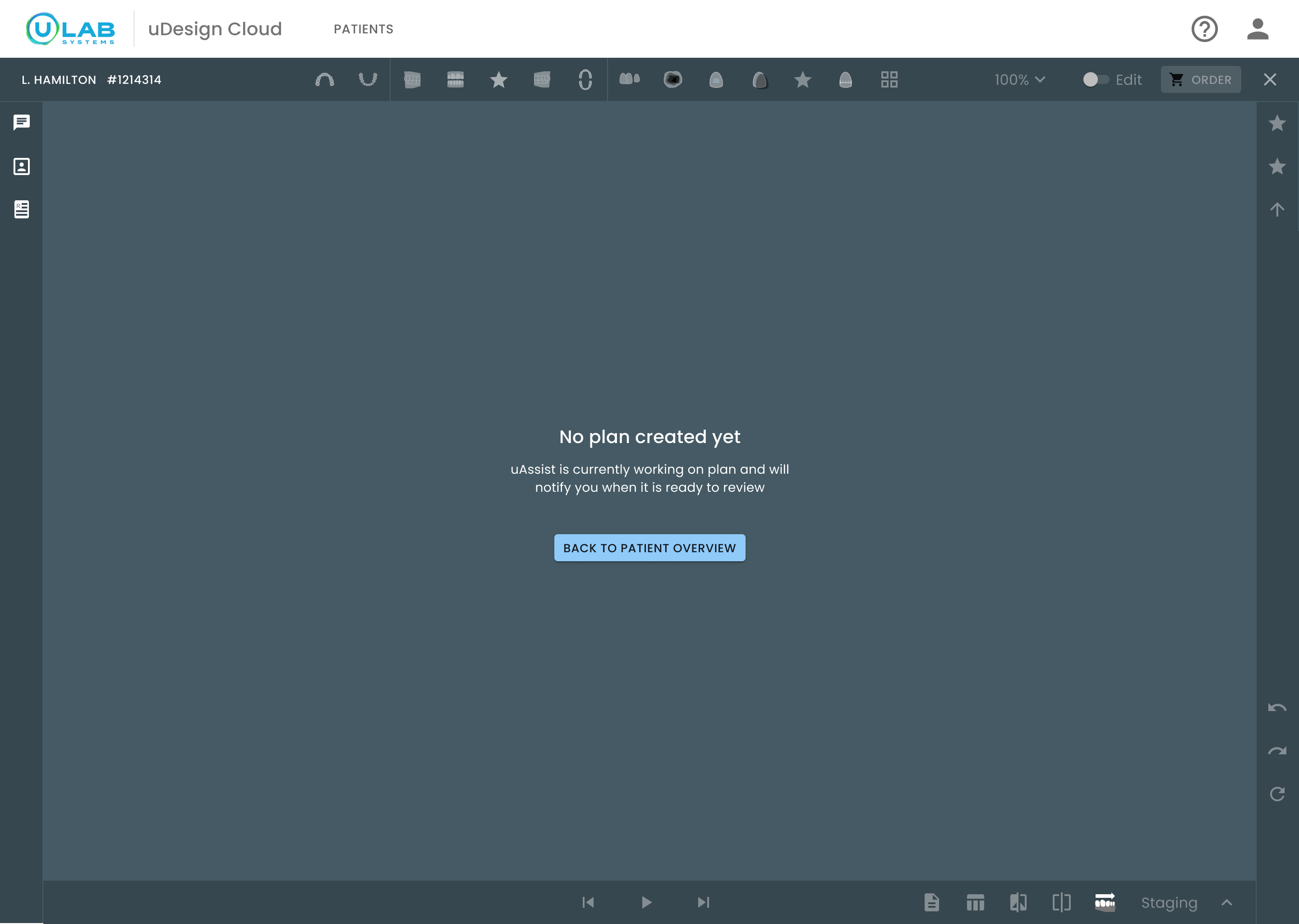
I led the product and engineering alignment that made uAssist the default first step. The 3D workspace would remain intentionally empty while the expert plan was prepared, then become a place to review rather than construct treatment.
Before the conference
After the conference
What does a doctor need before confidently approving a plan they did not construct?
Design strategy
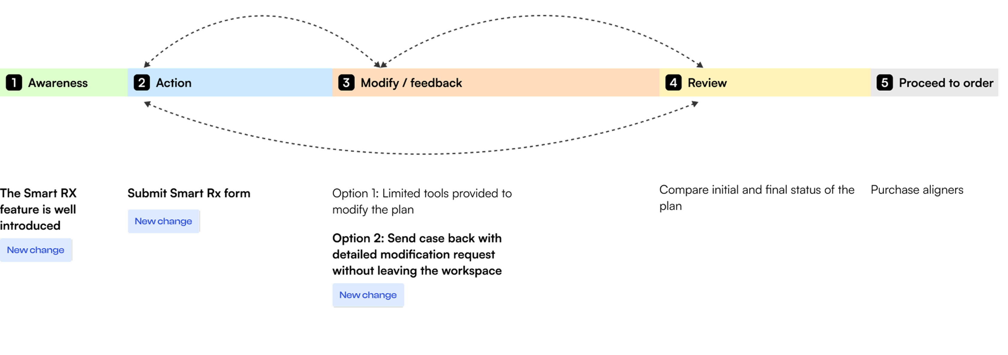
I translated the research into three proportionate paths—verify, adjust, and escalate—rather than a required sequence. A doctor can inspect evidence, make a bounded correction, request expert help, or approve whenever the plan is clinically sound.
The workspace became an instrument of clinical judgment—not a 3D engine doctors had to learn.
Three scope decisions
The strategic shift did not add Smart Rx on top of the original concept. It changed where the journey started, how much control belonged in the workspace, and how doctors expressed precision.
Smart Rx was a help feature inside the 3D workspace.
Move prescription submission to the start of the journey; keep modification requests inside the case.
The workspace stays focused on reviewing a plan, while expert help remains available at the moment it is needed.
The first direction exposed broad auto-treatment controls.
Limit doctor editing to bounded tooth movement and route substantial changes to uAssist.
Doctors retain clinical control without being asked to become 3D-production specialists.
A continuous slider offered movement without dependable precision.
Use coarse and fine numeric steps, typed values, and direct manipulation in the same clinical units.
Every change resolves to a reviewable number that can travel into reports and manufacturing.
System architecture
The architecture I designed replaced disconnected modes with one persistent workspace. The 3D plan stays at the center while only the evidence or control needed for the doctor’s current decision changes.
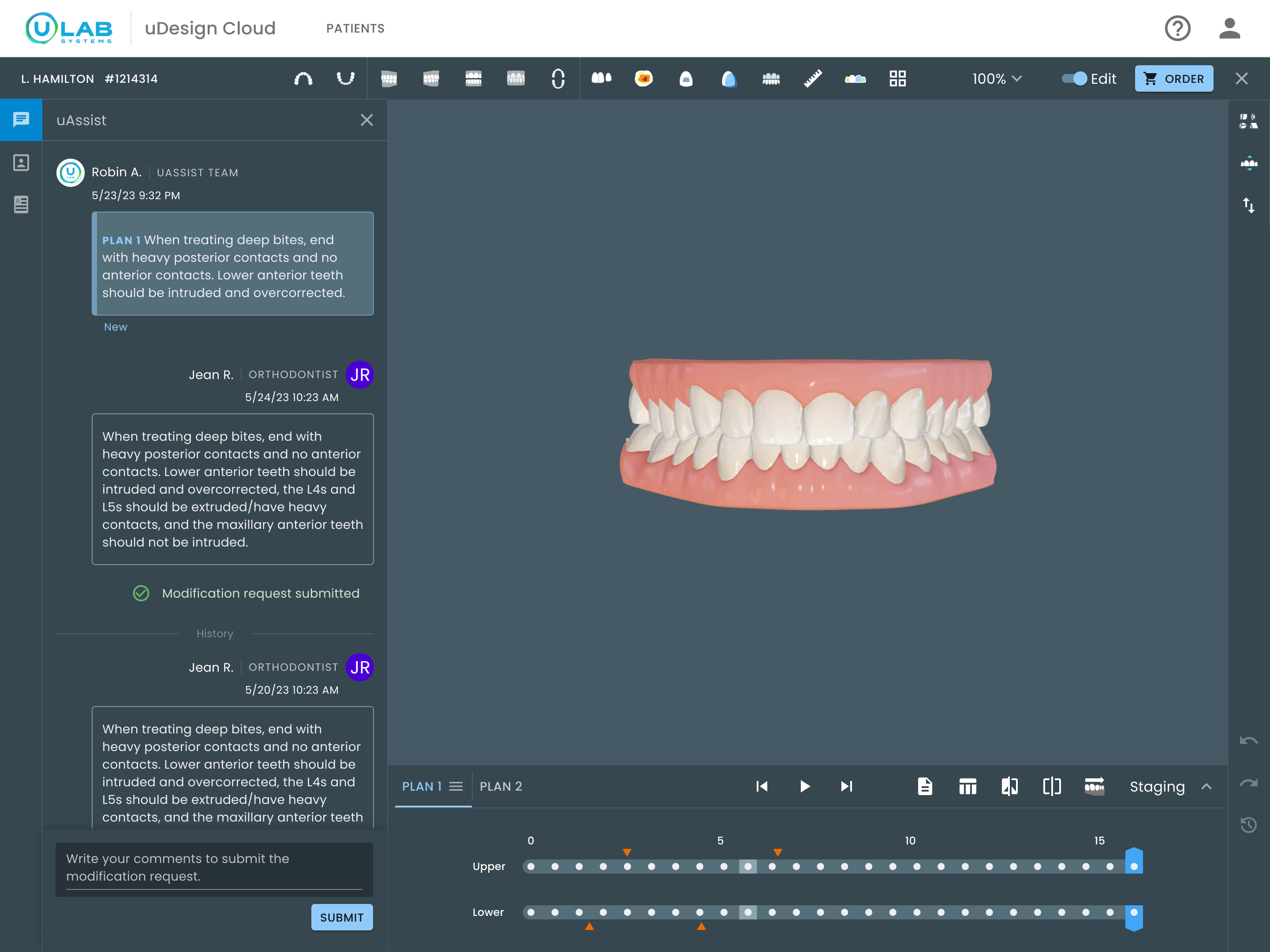
Verify
For verification, I brought records, prescription intent, movement values, and reports into the 3D review context. Doctors could validate a proposed plan without trusting it blindly or reconstructing its logic across screens.
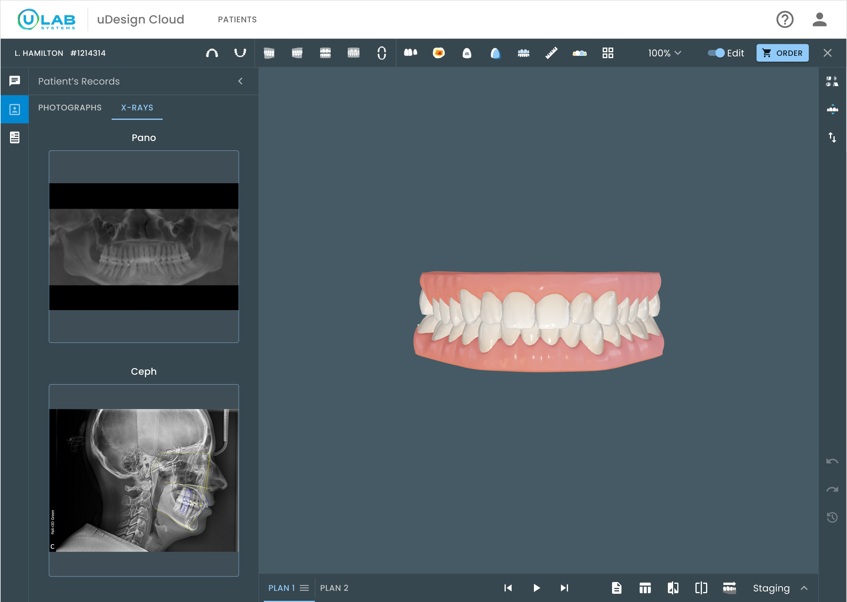
Verification stopped being a context switch and became part of the act of reviewing.
Adjust
I worked with clinical experts and machine-learning engineers to confirm a deliberately narrow first release: limited tooth-movement tools in familiar clinical units. We planned to add control phrase by phrase only after validating how doctors used each capability.
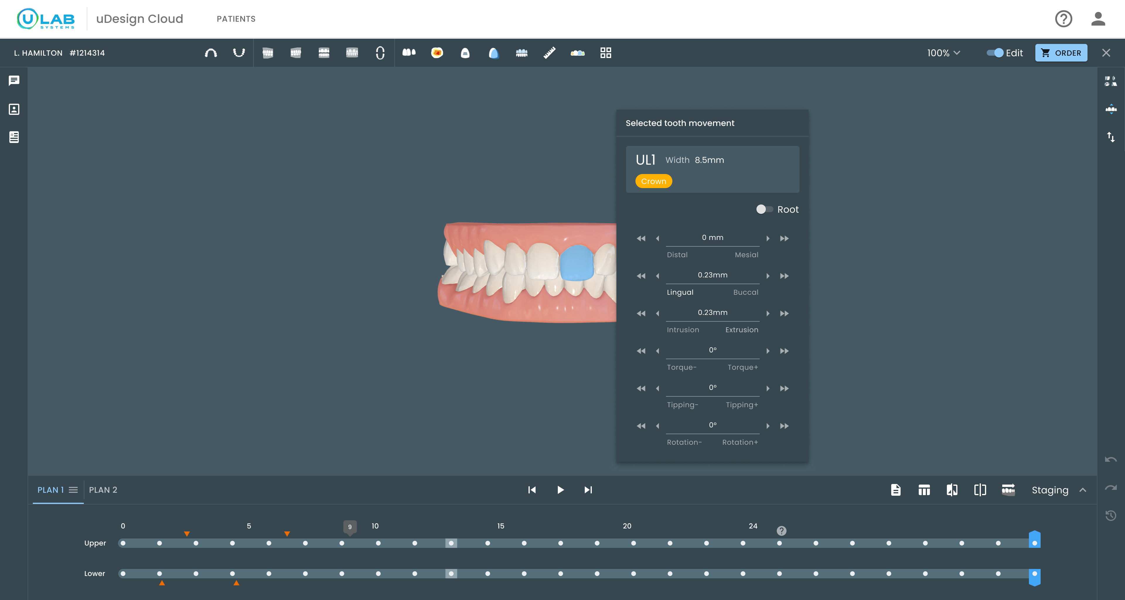
Untouched

A dotted rule means this axis was never adjusted. Scanning six rows, the doctor sees which ones they touched without reading a single number.
Focused

The rule goes solid and takes the accent color, and the numeral brightens while the unit stays dim. The value is the data; mm is only reference.
Tooth moved

The active direction brightens while the tooth moves, then returns to rest when the value is applied.
Plan through time
I chose discrete dots because each stage is a saved treatment state—not a moment on a continuous slider. Color bands separate the original plan from refinements, while the shared sequence keeps progression and authorship visible together.
Legacy staging
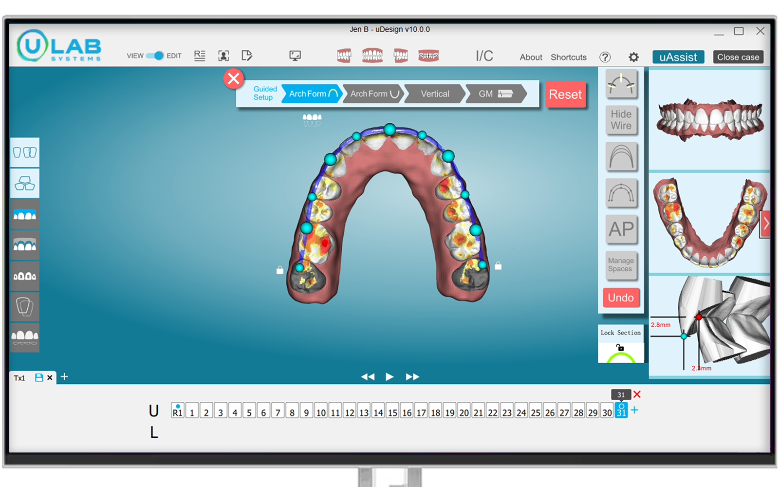
Redesigned staging
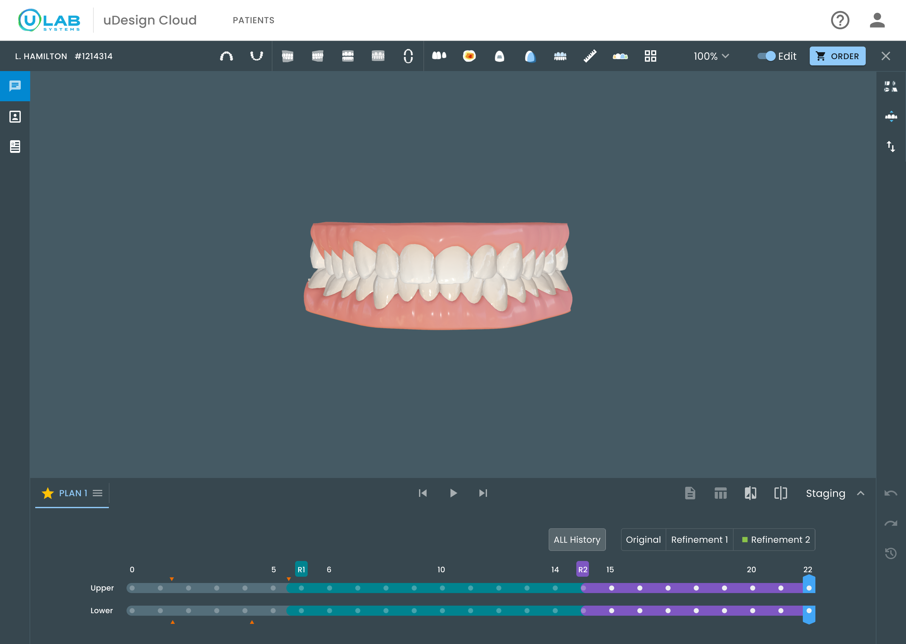
Jump directly to a saved treatment state.
Separate the original plan from each refinement.
Play progression or inspect one stage in detail.
Breadth and delivery
Beyond the primary review loop, I carried the same model through alternate plans, single-arch cases, report states, missing records, errors, onboarding, staging variations, and ordering handoff. The final design covered the wider clinical system—not only an ideal workspace flow.
Delivery beyond one screen
I worked across product and engineering to turn the research decisions into buildable behavior, while partnering with another UX designer on foundations that could scale beyond this workspace.
We turned conference feedback into a first-release boundary: uAssist first, clinical review next.
We translated the persistent workspace into buildable states across onboarding, records, errors, review, and ordering.
We aligned tooth-movement controls, staging, and version history with the constraints of the existing 3D engine.
We defined where automation prepared the plan, where doctors could edit it, and when expert input remained necessary.
With another UX designer, I created shared typography, clinical icons, controls, messages, and plan states adopted across the product portfolio.
Reflection
Bounded editing only works because verification and escalation are equally deliberate. More control is not automatically more confidence.
Design the escalation loop before expanding editing power.
I designed the tooth-level controls first. In hindsight, the ability to stop, explain the issue, and hand the plan back is what makes bounded editing safe.
Instrument what doctors adjust versus escalate.
The 40% beta efficiency result is directional and self-reported. I would pair it with time-in-stage, edit frequency, escalation rate, and whether returned plans resolve the original concern.
Push arch-level review further.
The tooth-level property panel is strong. The next opportunity is richer review at the arch, occlusion, and smile-arc levels—closer to how doctors judge the whole plan.
The visible deliverable was a redesigned 3D workspace. The deeper outcome was a safer relationship between automation, expert support, and clinical accountability.
Next case study
uLab Systems — Making bundle pricing honest at the point of order →